THE CORNER OFFICE
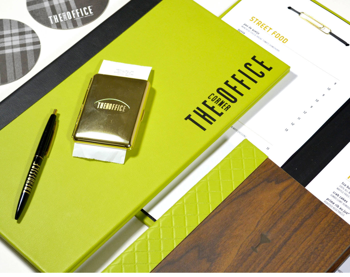
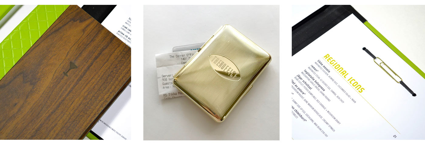
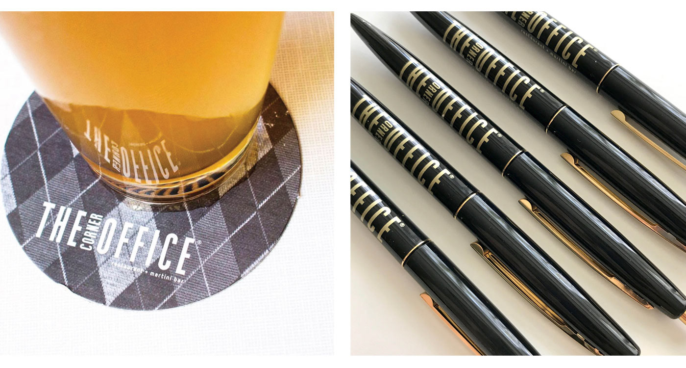
Brand refresh I designed with an existing logo for The Corner Office in Denver, Colorado. I had so much fun with the concept behind these leather menu books. The menus themselves I had bound into the book with a rubberband/paperclip combo. Coasters, pens, and the rest of the menus also follow the office/sexy Mad Men-era theme, with my favorite detail being the check presenters that are repurposed from vintage-style cigarette cases.
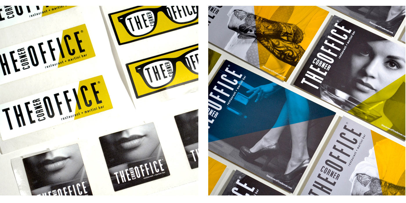
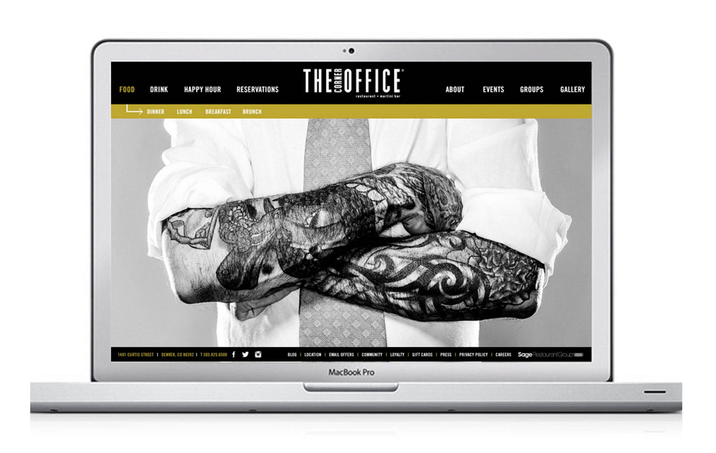
Business cards, stickers, postcards, envelope and letterhead and a website also complemented the rebranding with edgy photography and bright colors.
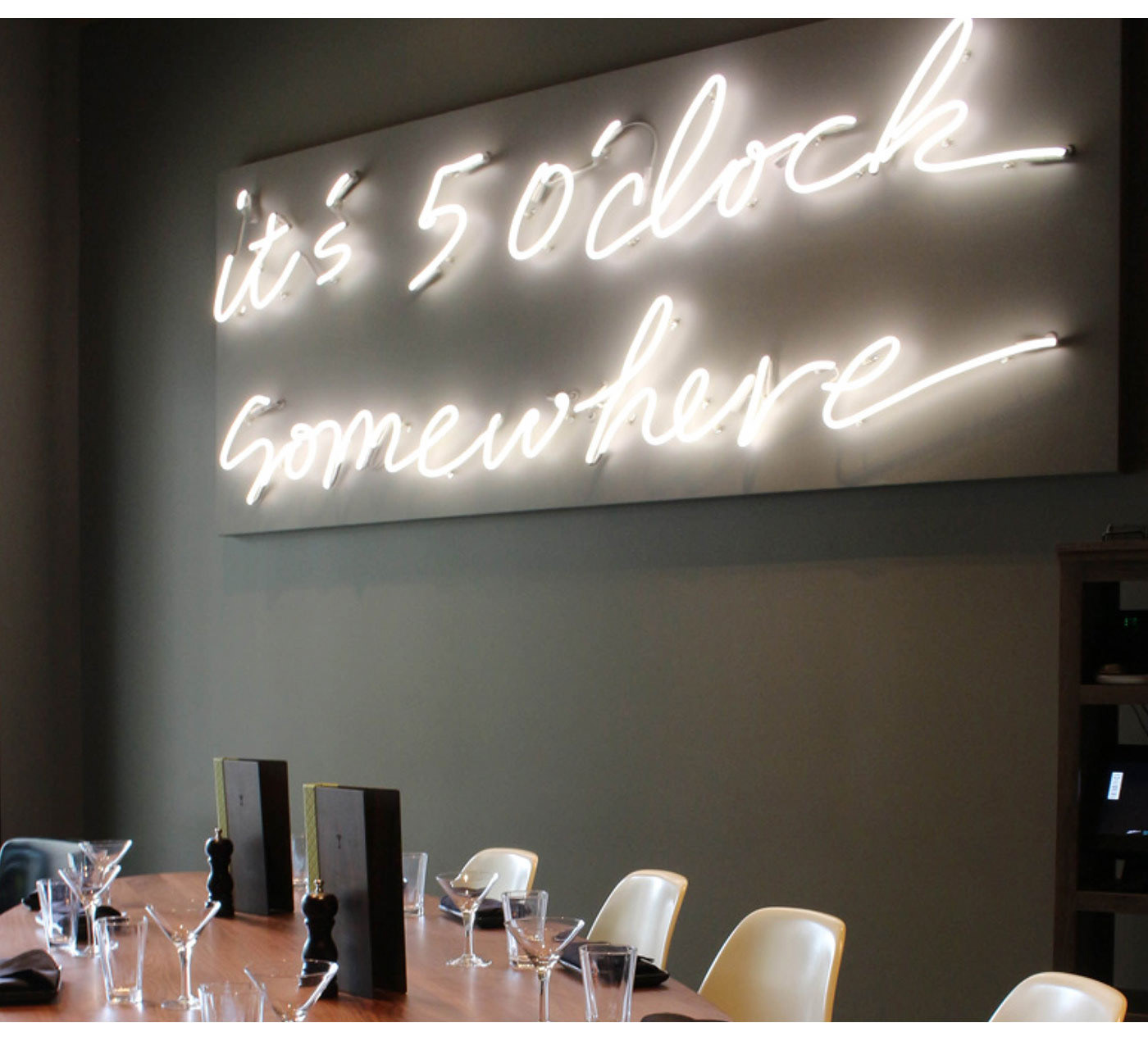
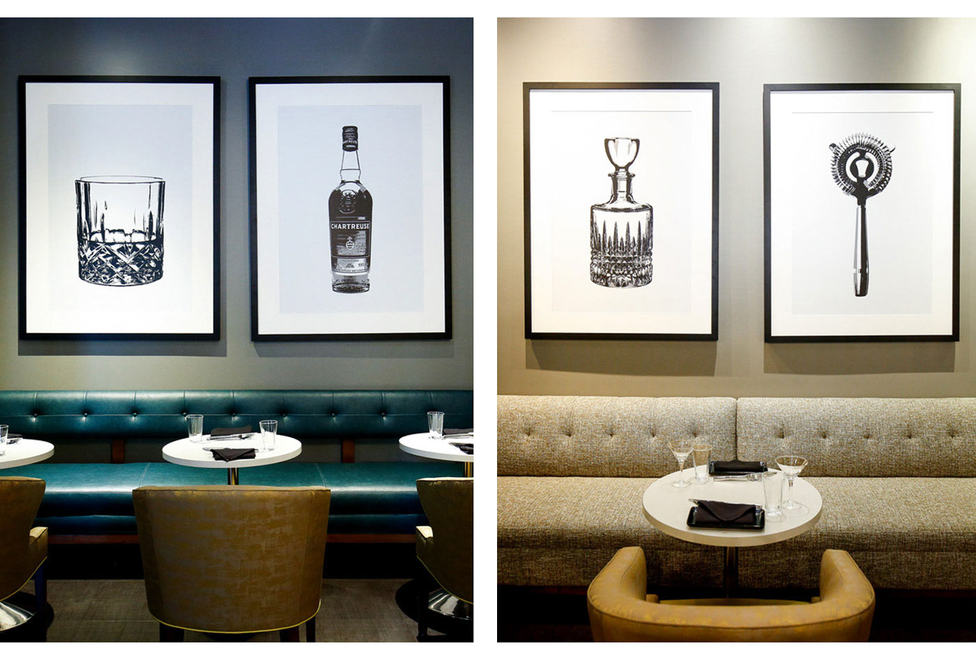
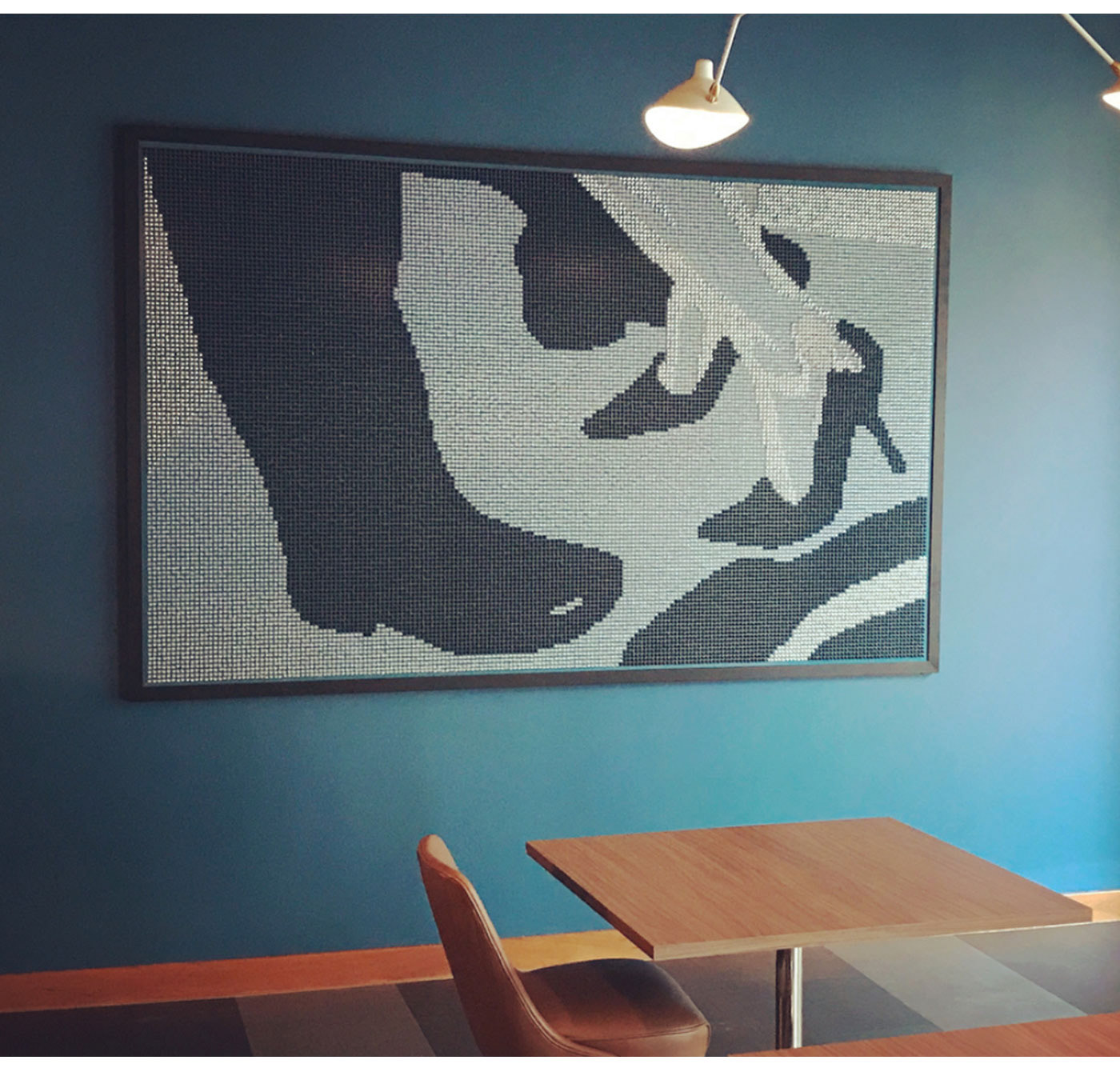
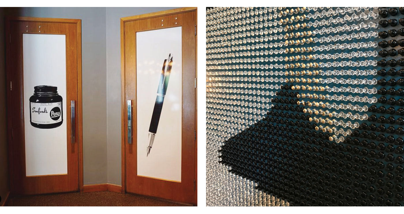
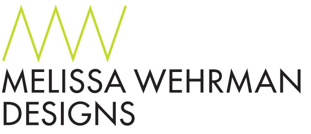
Lastly, they asked for my help with some art installations. Custom B&W illustrations of our favorite drink accessories, as well as a tongue-in-cheek restroom windows graphics (“don’t dip your pen in the company ink!”). The entrance greeted you with my custom handwriting that was transferred into neon declaring "it's 5 o'clock somewhere." But my favorite piece was an 8-foot wide panel with more than 25,000 office pushpins. It was a labor of love between myself trying to strategically graph out the placement of each pushpin and the poor installation team I hired to make the magic happen.
_ _ _ _ _ _ _ _ _ _ _ _ _ _ _ _ _ _ _ _ _ _ _ _ _ _ _ _ _ _ _ _ _ _ _ _ _ _ _ _ _ _ _ _ _ _ _ _ _ _ _ _ _ _ _ _